With the exception of motion controls and other gimmicks, innovations, and gimmicky innovations, the modern home console controller is fairly well-standardized as of 2015. Consider the following:

Source: http://www.digitaltrends.com/gaming/dualshock-4-controller-will-work-plug-mac/
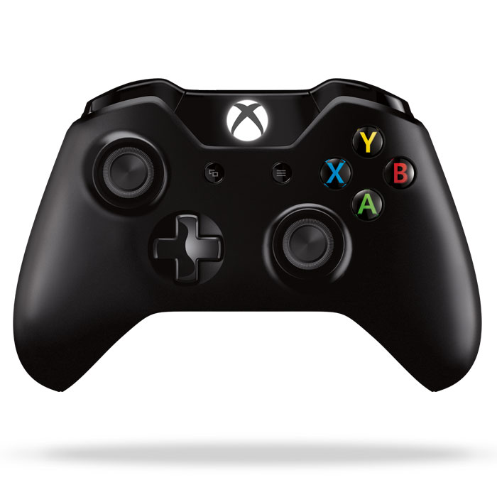
Source: http://www.xbox.com/en-US/xbox-one/accessories/controllers/wireless-controller

Source: http://www.engadget.com/products/nintendo/wii/u/pro-controller/
All the controllers have roughly the same design: a cross of four face buttons, a D-pad, two analog sticks, bumpers and triggers, and two or three extra buttons in the middle. For whatever reason, all three controllers have slightly different placements for the analog sticks. Let's take a look at the GameCube's controller:

Source: https://en.wikipedia.org/wiki/GameCube_controller
Instead of a generic cross, the face buttons are arranged in some kind of whimsical balloon animal configuration. The buttons are distinguished by more than just position: the A button is differed from the B button by size, and both are differed from the X and Y buttons by shape. The labels on the buttons are also engraved rather than simply printed. All of this allows the player to easily identify the four face buttons by touch.
The two analog sticks are likewise distinguished. The left stick, the Control Stick, has three concentric circles to improve grip (since reduced to one, presumably to prevent calluses). The right stick, the C-Stick, has the letter C engraved into it and is smaller. The two sticks are not limited in their range of motion by a circle, but by an octagon. This allows for the player to more easily input a specific direction, as with the D-pad.
Following the rest of the design, the D-pad features arrows engraved into each of the four arms. It also features a curious pit in the middle, presumably to more easily rest the thumb in a neutral state.
Let's take a closer look at the shoulder buttons:

Source: http://www.8-bitcentral.com/nintendo/gameCubeImages.html
The L and R buttons feature two valleys in which the index fingers can nest comfortably. How natural this feels, especially compared to the anti-ergonomic L2 and R2 buttons of the DualShock, is difficult to overstate. It is here where the controller truly shines as it melds with two human hands.
It is difficult to understand why these design decisions have been ignored in a post-GameCube world. My own hypothesis is that it was too unslick and colorful to be imitated by later designers. Standard controllers became marketed exclusively to hardcore gamers, while new motion controls were aimed at the casual crowd. Such a clown-like design could not survive those who took games seriously.
No comments:
Post a Comment